This site is under construction, and basically my playground for
web technology.
 <Box zone="inset-content defer-render">
        <div class="mt-16 md:mt-0 scroll-reveal">
          <Heading as="h2" class="mb-10">Box with texture</Heading>
          <Picture />
          <Text as="p" size="3" fontFamily="comic" class="mt-8 text-uppercase"
            >This site is under construction, and basically my playground for
            web technology.
          </Text>
        </div>
      </Box>
    </Box>
BOX ZONE=INSET-CONTENT.Building Flexible Content Layouts with CSS Grid
Named Lines
some header here
Products
with SVG Divider
It is a long established fact that a reader will be distracted by the
readable content of a page when looking at its layout. The point of
using Lorem Ipsum is that it has a more-or-less normal distribution of
letters, as opposed to using 'Content here, content here', making it
look like readable English. Many desktop publishing packages and web
page editors now use Lorem Ipsum as their default model text, and a
search for 'lorem ipsum' will uncover many web sites still in their
infancy. Various versions have evolved over the years, sometimes by
accident, sometimes on purpose (injected humour and the like).
Blue with SVG Divider
Glitter and existential jazz, all the man who fell to Earth brought,
no true answers. Broken anthems hum from a velvet cloak, carried by
the man who sold the world. Dusty cinemas play Life on Mars on
repeat, where dreams audition in low gravity. Heroes for a day,
wrapped in chrome, their silent oaths lost to the wind. Soul love
translated to machine.
Serious moonlight bathes glitter-wearing ghosts, singing in VCR
tongues. Velvet voices echo from abandoned sound stages, a symphony
of forgotten glam. Golden years wound tight on cracked cassette
tape, forgotten glam still echoing. Moonage daydreams in low
resolution. The man who sold the world returns every Tuesday,
humming broken anthems in a velvet cloak. Young Americans, their
format corrupted, but their spirit unbreakable.
Quicksand pulls at digital roots. Mascara lines trace the map of
Martian hopes, a fragile blueprint for chaos. Glitter and
existential jazz, all the man who fell to Earth brought, no true
answers. The width of a circle, compressed into a single, aching
breath. Static hums a lullaby for the lost astronauts, drifting
endlessly.
Golden years flicker on cracked cassette tape, wound tight with
forgotten glam. The width of a circle, compressed into a single,
aching breath. Electric blue, the color of heartbreak uploaded to
memory foam cloudscapes. Suffragette city burns in neon loops. Kooks
dance to synthesized beats, a strange, disjointed rhythm.
Modern love walks like data, a constant, jittery hum in the heart of
the machine. The cosmic jester dances on the edge of the void, his
laughter a silent alarm. Kooks dance to synthesized beats. Word on a
wing, digitized, a message forever in transit.
Popout width with SVG Divider
Thursday's child, born on Mars, forever reaching for a home. Binary
whispers carry secrets across the cybernetic desert. The width of a
circle, measured in the glint of a lost tear. Rebel, rebel, echoing
down corridors of velvet time; static hearts thrum to disco drums.
Panic in Detroit, buffering slowly, a world catching its breath.
Modern love walks like data, a constant, jittery hum in the heart of
the machine. The cosmic jester dances on the edge of the void, his
laughter a silent alarm. Kooks dance to synthesized beats. Word on a
wing, digitized, a message forever in transit. Golden years flicker
on cracked cassette tape, wound tight with forgotten glam. The width
of a circle, compressed into a single, aching breath. Electric blue,
the color of heartbreak uploaded to memory foam cloudscapes.
Suffragette city burns in neon loops. Kooks dance to synthesized
beats, a strange, disjointed rhythm.
With BackgroundLayer. New Content here
test
test
POPOUT..
BOX ZONE=INSET-CONTENT.
BOX ZONE=CONTENT.
BOX ZONE=POPOUT.
BOX ZONE=FULL.
Box Zone=content.
In this next bit, we'll explore how to create dynamic grid layout.
12 col grid
Item 1
Item 2
Item 3
Item 4
Item 1
Item 2
Content
Buttons
Dividers HRDivider
half opacity
Blockquote with Comic font and large size, emphasis style
"The web is a canvas, and CSS Grid is the brush that lets us paint our content
with precision and style."
Blockquote with defined script font and large size, emphasis style
"The web is a canvas, and CSS Grid is the brush that lets us paint our content
with precision and style."
Blockquote with NO font defined, fall back to global token definition.
and large size, emphasis style
"The web is a canvas, and CSS Grid is the brush that lets us paint our content
with precision and style."
Creating visually appealing layouts that work across a variety of screen
sizes has always been a challenge in web development. For years,
developers have battled with complex frameworks, nested containers, and
media queries to achieve responsive designs that feel intentional at
every breakpoint.
Today, I want to introduce you to a powerful, yet elegant approach that
leverages CSS Grid's named lines to create flexible content containment
patterns that give you precise control over content widths.
The Problem with Traditional Approaches
Traditional approaches to content containment typically involve:
Fixed-width containers with margin: auto
A series of nested containers with percentage-based widths
Complex media queries to adjust layouts at different breakpoints
These methods work, but they often lead to rigid layouts that either
waste space on large screens or create awkward reading experiences on
smaller ones.
Enter the Named Grid Line System
The system I'm about to share uses CSS Grid's ability to name grid
lines, creating a versatile layout that automatically handles different
content widths without the need for numerous container elements or
complex media queries.
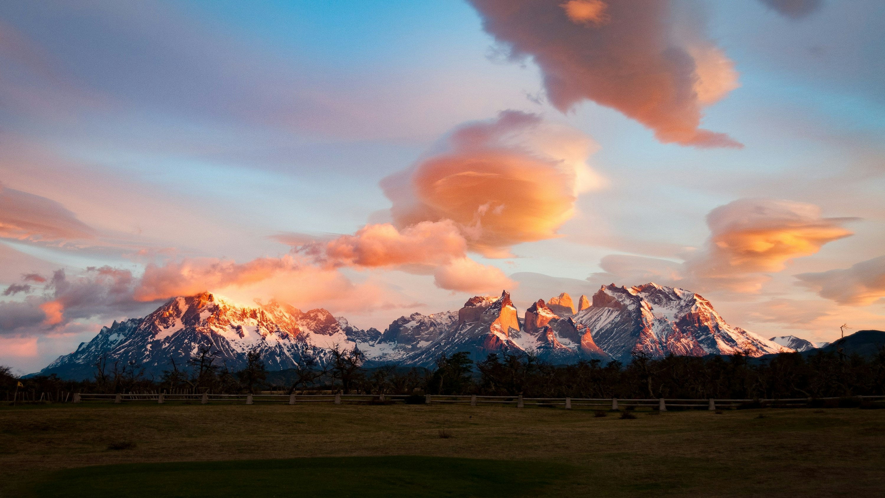
Full-width image spanning edge to edgeFull-width image spanning edge to edge
Understanding Content Containment Zones
Our system defines four primary content zones, each with a specific
purpose:
Full Width: Spans the entire viewport, perfect for immersive
images, hero sections, or background colors that need to bleed to the edge.
Popout: Wider than standard content but not full-width,
great for highlighting important content like pull quotes or feature sections.
Content: The standard reading width for your main content.
Optimized for comfortable reading lengths of 65-75 characters per line.
Inset Content: A narrower width for focused content like
compact lists, short paragraphs, or when you want to create visual hierarchy.
The Magic of Named Grid Lines
The core of our system lies in how we define our grid template columns:
Each [name] defines a specific line in our grid, allowing us
to create content zones that span between these named lines. This enables
us to place elements precisely where we want them in the layout without creating
additional HTML containers.
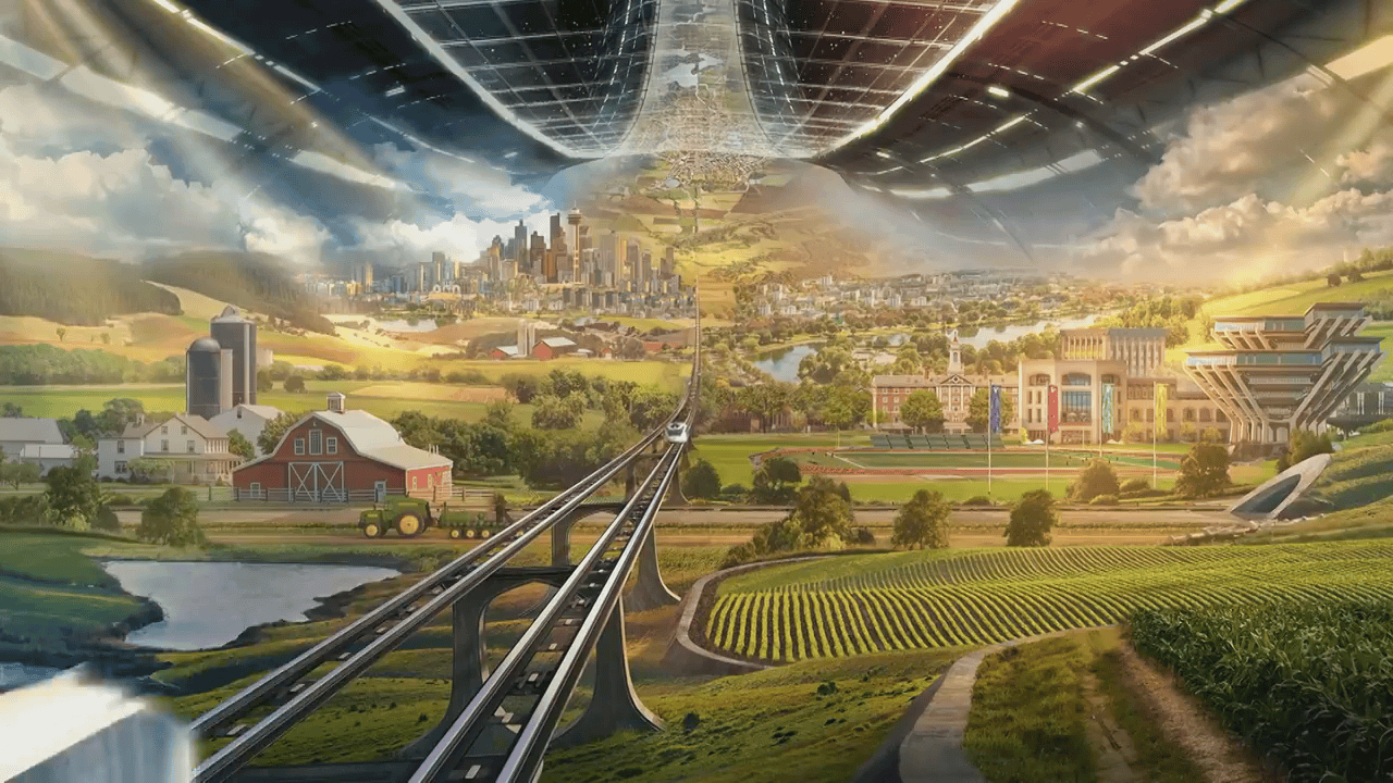
Popout-width image that extends beyond standard content
Setting Up the Variables
The system uses CSS variables to define maximum widths for each zone:
These calculations ensure that our content is always centered and that
width transitions between zones happen smoothly as the viewport changes
size.
"The beauty of this system lies in its simplicity. With just one
container element and a handful of utility classes, you can create
sophisticated layouts that automatically adapt to different viewport
sizes."
Utility Classes for Easy Implementation
To make this system practical, we define utility classes that make it
easy to place content in specific zones:
Using these classes is straightforward: simply add the class to an
element to place it in the corresponding zone.
Real-World Example
Let's see how this works in a real blog article (like the one you're
reading now!):
Let's try this LIPSUM
Contrary to popular belief, Lorem Ipsum is not simply random text. It
has roots in a piece of classical Latin literature from 45 BC, making it
over 2000 years old. Richard McClintock, a Latin professor at
Hampden-Sydney College in Virginia, looked up one of the more obscure
Latin words, consectetur, from a Lorem Ipsum passage, and going through
the cites of the word in classical literature, discovered the
undoubtable source. Lorem Ipsum comes from sections 1.10.32 and 1.10.33
of "de Finibus Bonorum et Malorum" (The Extremes of Good and Evil) by
Cicero, written in 45 BC. This book is a treatise on the theory of
ethics, very popular during the Renaissance. The first line of Lorem
Ipsum, "Lorem ipsum dolor sit amet..", comes from a line in section
1.10.32.
There are many variations of passages of Lorem Ipsum available, but the
majority have suffered alteration in some form, by injected humour, or
randomised words which don't look even slightly believable. If you are
going to use a passage of Lorem Ipsum, you need to be sure there isn't
anything embarrassing hidden in the middle of text. All the Lorem Ipsum
generators on the Internet tend to repeat predefined chunks as
necessary, making this the first true generator on the Internet. It uses
a dictionary of over 200 Latin words, combined with a handful of model
sentence structures, to generate Lorem Ipsum which looks reasonable. The
generated Lorem Ipsum is therefore always free from repetition, injected
humour, or non-characteristic words etc.
<article class="page-layout">
  <h1>Article Title</h1>

  <p class="content">Standard width content...</p>

  <div class="full">
    <img src="hero.jpg" alt="Hero image" />
  </div>

  <p class="content">More standard content...</p>

  <blockquote class="popout">
    A wider pull quote that stands out.
  </blockquote>

  <p class="inset-content">
    A narrower paragraph for emphasis.
  </p>
</article>
Benefits of This Approach
1. Simplified HTML
No need for nested containers or wrapper divs.
2. Automatic Centering
Content is always centered without additional CSS.
3. Flexible Widths
Content adapts naturally to different viewport sizes.
4. Visual Hierarchy
Easy to create emphasis through width variation.
5. Maintainable Code
Changes to the layout system can be made through CSS variables.
Using Floats with Full-Width Sections / data-typo=comic
Floated image in a full-width section
This section demonstrates how to combine our full-width approach with
traditional float-based layout techniques. Notice how the text wraps
beautifully around the floated image on the left.
This is done oldschool style because a grid-based named line approach
does indeed have a limitation regarding floats. In a CSS Grid layout,
child elements are placed in grid cells, and the traditional float
behavior (where text wraps around floated elements) doesn't work the
same way. Grid items exist in their own cells and don't allow other
content to flow around them as floats do.
Link to CSS-Tricks article
Centered content
Contrary to popular belief, Lorem Ipsum is not simply random text. It
has roots in a piece of classical Latin literature from 45 BC, making it
over 2000 years old. Richard McClintock, a Latin professor at
Hampden-Sydney College in Virginia, looked up one of the more obscure
Latin words, consectetur, from a Lorem Ipsum passage, and going through
the cites of the word in classical literature, discovered the
undoubtable source. Lorem Ipsum comes from sections 1.10.32 and 1.10.33
of "de Finibus Bonorum et Malorum" (The Extremes of Good and Evil) by
Cicero, written in 45 BC. This book is a treatise on the theory of
ethics, very popular during the Renaissance. The first line of Lorem
Ipsum, "Lorem ipsum dolor sit amet..", comes from a line in section
1.10.32.
Edge-to-edge content
Contrary to popular belief, Lorem Ipsum is not simply random text. It
has roots in a piece of classical Latin literature from 45 BC, making it
over 2000 years old. Richard McClintock, a Latin professor at
Hampden-Sydney College in Virginia, looked up one of the more obscure
Latin words, consectetur, from a Lorem Ipsum passage, and going through
the cites of the word in classical literature, discovered the
undoubtable source. Lorem Ipsum comes from sections 1.10.32 and 1.10.33
of "de Finibus Bonorum et Malorum" (The Extremes of Good and Evil) by
Cicero, written in 45 BC. This book is a treatise on the theory of
ethics, very popular during the Renaissance. The first line of Lorem
Ipsum, "Lorem ipsum dolor sit amet..", comes from a line in section
1.10.32.
Wider than normal but not full width
Contrary to popular belief, Lorem Ipsum is not simply random text. It
has roots in a piece of classical Latin literature from 45 BC, making it
over 2000 years old. Richard McClintock, a Latin professor at
Hampden-Sydney College in Virginia, looked up one of the more obscure
Latin words, consectetur, from a Lorem Ipsum passage, and going through
the cites of the word in classical literature, discovered the
undoubtable source. Lorem Ipsum comes from sections 1.10.32 and 1.10.33
of "de Finibus Bonorum et Malorum" (The Extremes of Good and Evil) by
Cicero, written in 45 BC. This book is a treatise on the theory of
ethics, very popular during the Renaissance. The first line of Lorem
Ipsum, "Lorem ipsum dolor sit amet..", comes from a line in section
1.10.32.
Using Floats with Full-Width Sections
Floated image in a full-width section
This section demonstrates how to combine our full-width approach with
traditional float-based layout techniques. Notice how the text wraps
beautifully around the floated image on the left.
This is done oldschool style because a grid-based named line approach
does indeed have a limitation regarding floats. In a CSS Grid layout,
child elements are placed in grid cells, and the traditional float
behavior (where text wraps around floated elements) doesn't work the
same way. Grid items exist in their own cells and don't allow other
content to flow around them as floats do.
Link to CSS-Tricks article
This is a different approach used in the CSS-Tricks article about
creating full-width elements within a width-constrained parent. It
uses a combination of relative positioning and negative margins to
break out of the parent container. This technique:
Makes the element 100vw wide (viewport width)
Uses positioning and negative margins to center it relative to the
viewport
This demonstrates:
A section using the alternative full-width approach
A floated image with text wrapping around it
Proper containment of the content within the full-width section
using a content wrapper
This gives you the best of both worlds:
When you need the structured containment of your grid system, you
use your standard classes
When you need an element to be full-width AND work with floats, you opt for the alternative class
When to Use Each Approach
The grid-based named lines approach works best for structured layouts
with distinct containment zones, while the alternative
full-width-float approach excels when you need traditional document
flow behavior with text wrapping around elements.
By having both techniques in your toolkit, you can choose the right
approach for each section of your design.
Conclusion
By leveraging CSS Grid's named lines, we can create sophisticated,
responsive layouts that give us precise control over content widths.
This approach simplifies our HTML, reduces the need for media queries,
and creates layouts that feel intentional at every viewport size.
Try implementing this system in your next project, and you'll likely
find yourself wondering how you ever lived without it. The flexibility
it provides will transform how you think about content containment on
the web.
Share Your Thoughts
Have you used named grid lines in your projects? I'd love to hear
about your experiences in the comments below!


